Tuesday 24 August 2010
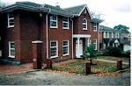
extended house at Chigwell (1+2/3)
Below, two pictures of one of my bigger projects in Chigwell. The centre portico is new, as is the side extension with the garage over. There is also a swimming pool at he rear which I part-designed This scheme was only built after going to appeal, and after a long battle with Epping District Council. The upper floor on the left side of the main house, which can be identified by a slight change of brick colour, is also new, and this part of the extended house contains a new staircase. I also designed some new high railings and ornate gates to give the owner some security, but ,to my astonishment, Epping Council refused Planning Permission, on the rather questionable grounds that the chief Planning Officer thought that the applicant had ideas above his social station. Perhaps he thinks that ostentation is best left to royalty and the landed gentry.


Thursday 19 August 2010
House in Normanshire Drive www.e17houseplans.co.uk.
Pictured below: a new house in Normanshire Drive, Chingford, built about three years ago for the owner of the house on the left. I produced the drawings to obtain Planning Permission, and the client sold them on to a developer, who built the scheme.
A new client wants a loft conversion in the same road, and has seen this house.


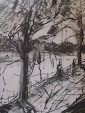
Mutiny on the Raft
Below, an earlier sketch by Gericault illustrating an outbreak of fighting on the raft. Cannibalism, starvation and murder reduced the original 149 cast adrift to just 10 eventual survivors.


Wednesday 18 August 2010
Preparatory sketch for the Raft of the Medusa.
Above, a preliminary sketch for Gericault's Raft of the Medusa.
I prefer this unfinished and preparatory version: it is more lively and fresher. The figure at the apex of the pyramid of figures is signalling to a clearly visible rescue ship. The composition is simpler and less contrived. I particularly like the way the edge of the raft pitches upwards against the choppy horizon line, punctuated by the huge wave on the left, giving a real sense of being in a stomach-churning swell., and in danger of an imminent capsize.
Sunday 15 August 2010
Below, some paintings exhibited in June 2008.
In 2007 Alistair Kendry persuaded me to take A level Art just for fun-he said it would push me. I laughed, but it did.
The paintings and drawings are round and about the theme of the expulsion of Adam and Eve from the Garden of Eden, and of course borrow heavily from Masaccio.
The paintings are acrylic on board or canvas, and the black and white drawing is charcoal on paper.
The small images at the top are monoprints.
The large painting on the left is my attempt at the final A Level examination, which was supposed to be about twelve hours, but I left early, after about six hours.

Saturday 14 August 2010
Whistler : Westminster bridge
This picture comes from a book by John Walker, and depicts the building of the new Westminster Bridge in the !860's.
Often art-books covering an artist's whole career contain delightful surprises like this: Whistler's Nocturnes , or his famous Japanese pictures, or the Falling Rocket picture are reproduced ad nauseam, but I have only ever seen this wonderful painting in this one book. Here, his approach is fairly conventional, as opposed to his later, distinctive style, but the sense of light and open space, and the fluidity of the brushwork all stand out., as does his subtle use of colour, the warm browns of the bridge against the cold of the blue sky.
The initial idea of uploading this and the following images was simply to reply to the art trail questionnaire, but I have since become engrossed in the whole process: just by finding the pictures in the first place I am re-visiting books that I have not opened in years, in some cases; also, scanned book illustrations look brilliant when lit up on a computer screen. The picture order is random, and I do not pretend that my comments are those of a scholar: they are simply what comes to mind when I look at he pictures. What should come to light is my attitude to art, in particular to art education.

Edward Hopper:: American Realist
One of Edward Hopper's lesser-known illustrative paintings, a seascape painted on the spot in Maine in 1916.

Wednesday 11 August 2010
Degas sketch of horses
I'm looking through Jeffery Camp's wonderfully illustrated book. "Paint" as a way of unwinding after a long day.
Three of my "Medusa" paintings are on view at Leytonstone Library until the end of August.

Tuesday 10 August 2010
Meeting Mr Eyton RA
A few years go I went to the Royal Academy Summer Show, and was just leaving when I spotted a rather dishevelled figure standing at an easel in one corner of the courtyard, who I took to be a Sunday painter. I got closer, and could then see a pastel drawing of the RA facade in front of us. I did not recognise the artist, but the drawing was unmistakeable. "You must be Mr Eyton," I said. He beamed at me with pleasure, and I hurried away quickly, to avoid any further embarrassment.


Augustus John traduced.
Like John Singer Sargent, who I will mention later, Augustus John is one of those gifted artists who is now sneered at and dismissed as a nonentity. I have attended many life-drawing classes over my lifetime, and have yet to find an art-teacher with a good word to say about him. His crime seems to be to have too much talent: some people confuse facility with facile, that is the term of abuse meaning slick and meretricious. Whatever the true reason, it's nonsense, and simply shows up the sheep-like mentality of so many people who should know better, some of whom hold responsible jobs in education.
On a lighter note, one of my tutors at architecture school, called John Farmer, who did not lack self-esteem, had a son he called Gussie, Augustus John's nickname.
"Don't tell me," I said "he's called Augustus John Farmer"
"Yes,"said John Farmer, a bit sheepishly, absolutely deadpan. The man had no sense of humour.
Of course Michael Holroyd wrote a two-volume biography of John in the 1970's.


Bacon on Van Gogh
A favourite Bacon painting, a study of Van Gogh. The colour is powerful, but the figure does not bear close examination.

Getting noticed in writing (see picture below)
When I was an art-student I had to write several essays and two dissertations. Like many students, before and since, I craved some feed-back, or at least an indication that my efforts were being noticed and appreciated. At some point I told the tale below, in one of my essays, and for the first and only time in my writing career at that college a tutor made a warm remark, but I forget their exact words: probably along the lines of " I liked your story about...."

Looking at Van Gogh
My father , born in 1913, was a clever man, a scientist, by turns over-excitable and depressed. Nowadays he would be called bi-polar. He could, and did, talk at great length and with great animation about famous scientists, living and dead, or about artists, particularly Van Gogh, whose paintings he had seen in the 1940's. My father was born into poverty in Yorkshire, long before the advent of the Welfare State, and against the odds he won a scholarship to Oxford University. His family survived the Great Depression, but only just- his own father managed to hang onto his job, but was in constant fear of losing it. In short, my father knew better than most how precarious life can be at the margins of society. He was obsessed by the idea that Vincent's painting life was only made possible because it was paid for by his brother Theo.
One day , when I was about ten years old, he bought a reproduction of Van Gogh's Arles Cornfield painting (above) , framed it, and hung it over the fireplace at home. He then ordered us all into the room, my mother and twin sister and me, and insisted that we contemplate this picture for what at the time seemed like an age, but was probably only a minute or two. Of course, what my father was in love with was the notion of genius, recognised or not. He was also fascinated by art because it was one of the few things he couldn't do.
Saturday 7 August 2010

Cuming snow scene.
Above, another Cuming landscape: dusk, setting sun, blues and violets, and very subtle colours and tones that my scanner cannot cope with. For instance, the tree should be darker, and less viridian.
Friday 6 August 2010
Van Gogh: trees.
This is scanned from a book of cheap reproductions, but looks wonderful, particularly the writhing lines of the trees. The strong black outlines help enormously.

David Bomberg : landscape
Bomberg, who died in 1957, is now sadly out of fashion. One of my art-reference books states that after a brief phase when he pioneered Cubism in Britain he changed style and then produced 'gloomy, minor Expressionist paintings'. I am not sure which category the illustration below falls into: words like 'major', 'evocative' , and 'haunting' come readily to my mind.
The book in question is an illustrated dictionary by Robert Cumming; it does not include an illustration for Bomberg.


Ken Howard
Below, a self-portrait by Ken Howard.
Howard's abilities are obvious for all to see. He can paint a chair with a shirt on the chair-back with sunlight shining through it utterly convincingly, or , with a single stroke of orange paint, depict a switched-on bar of an electric fire so that its heat can be felt by the viewer. Famously he paints his own studio time and time again, with a figure, usually a life model, sitting in shade with, perhaps, her back to a window, and against the light. To do this requires an a top-level ability to draw and judge tone. It is no accident that views from room interiors, out of a window, or reflections in mirrors, as in this self-portrait, crop up so frequently in academic or traditional paintings. His brushwork is loose and impressionistic, and looks casual, but in fact is millimetre accurate, or else the drawing would disintegrate. The pleasure of looking at a Howard, as with many impressionistic paintings, lies in walking backwards and forwards, looking at the brushwork up close, and then stepping back until reality snaps into focus.
When I was at college I tried to get the teaching staff to show some enthusiasm for Howard, but failed. I put this down to ignorance and /or professional rivalry.


Thursday 5 August 2010
Paintings by Michael Stanger and recollections and observations about painting and art education
Below, two pictures:
2) An invented sea/land composition, approx A1 size, acrylic on paper.
1) Another Raft composition, approx A1 size, acrylic on paper
2) An invented sea/land composition, approx A1 size, acrylic on paper.
Both pictures date from the 1990's.


Save the Children
Below, a detail from a painting on hardboard, for a display hoarding for a carnival/fund-raiser for the Save the Children charity, back in the 1980's.


Wednesday 4 August 2010
1993 model of a scrapyard
Below: the image shows a balsa wood and paint 3D model for the scrapyard project at the beginning of the John Cass BA course.

de Stael makes a surprise appearance.
Below, another 4 foot x 3 foot painting, which is under-painted in Ultramarine Blue.
One day it was being marked by Peter Saunders, when Frank Collins burst into the room, and, without acknowledging me, started a furious argument with Peter, about some slight, real or imagined. Suddenly, Frank spun round, shot a glance at the painting on the wall in front of him and exclaimed: " Ah, de Stael ,"and then resumed his argument with Peter, without pausing for breath.
Of course, Frank was right, as usual-the painting is, I suppose, an echo of the blocky, geometric paintings of de Stael, particularly the under-painting.
The figures are awkward, but I find I am compelled to put figures in a landscape-of more interest to me is the cliff in the mid -distance: for some reason that I cannot fathom, cliffs crop up time and time again in my paintings, going back to my childhood.

Solar Landscape.
Below, an oil-painting on paper, about 4 foot x 3 foot, again produced in the early 1990's at John Cass art-school. I consider this to be one of my best, but sadly it is currently languishing in my loft, gathering dust, unseen and unloved.

Painting for pleasure, supposedly under direction
Below, another acrylic painting on paper, roughly A2 size, nominally of a scrapyard, and loosely based on photographs taken around Walthamstow, and from imagination, making decisions from one brush-mark to the next , but at speed.

An early clash with authority in 1991
Below, an early painting on paper, roughly A1 size, produced in about an hour, from life. My then teacher, Frank Collins, back in 1991, at John Cass school, objected to my use of thick charcoal outlines, although he let the fingerless hand go unremarked.
Frank did not want me to join the pre-degree course, since I came in mid-way through the first year , and he thought I might not catch up, although his colleague, and the better painter, Peter Saunders, had no such qualms. Frank also told me there and then that he thought that my paintings were too conventional for his taste, and for my own good, if I wanted to make any headway in my future career. Much the same was said by another member of staff within days of my joining the degree course. She asked me why I, as a mature artist, wanted to enrol at all. The aim of the school , she said,was to find the next exhibitor at the Whitechapel Gallery, which is just across the road from where we were sitting. Clearly I was not going to make it. In short, material success in the shark-infested art-world is largely about novelty, fashion, self-promotion, and marketing. Undirected talent comes well down the list. All I can do is paint for myself, and no other, and hope for the best.
Peter is an interesting man, a one-time Slade prize-winner, who at that time painted oil-rich gestural interiors and landscapes, particularly of the Kent coast, reminiscent of Bomberg, but more vibrant, with a better colour sense, and just as memorable.

Tuesday 3 August 2010
Going vibrant grey
Pictures from my last year painted from the studio window: small scale. in blue/grey and black tones, with sometimes a touch of Umber.


Not doing as I was told, but painting on an art course.
I painted the previous picture in lieu of attending an incomprehensible seminar about, I think, sexual politics being conducted in the same room by the ex-partner of the Head of School. She thought I was trying to snub her (I was), and tried, unsuccessfully, to get me thrown off the course.
A Shepherd's Bush public house.
The picture below was painted in under an hour, and was produced from imagination, based on the previous day when I measured up a public house in Shepherd's Bus for a building survey.
If you look hard you can make out a figure leaning against the bar, figures drinking at a table and the tape measure, with a figure holding one end.


Being ignored.
By the end of my fourth year of five I was producing something like this, on the same scale as the previous painting. By now I was invisible: on the rare occasions that a member of staff showed up he or she walked wordlessly past me. The staff all wore black, and were mostly impervious to colour. I therefore switched to cheap black -and-white paintings for my final year, and swore never to try too hard again, or to care what others thought of me.

Asking difficult questions
The painting below was produced from observation from the college staircase landing, and memory, and shows a typical Whitechapel view. I had the painting taped to a wall. and was using masking tape to indicate my perspective vanishing lines and the horizon line.The aforementioned Head of School walked into the studio and I made the mistake of asking his advice about the perspective. Remember that by this time I no longer had the scene in front of me.
Obviously, in my first term at this school, and having my first conversation with this man, I was expecting an erudite reply, or at the very least a helpful remark.
His reply, with me hanging on every word?
"Why are you painting a Nineteenth Century picture?"
With that he turned round and walked out of the studio.
He didn't have a clue, or if he did, he preferred a smartarse remark to saying anything useful to me.
Early days on a five-year course..
The picture below is of a painting, about 4 foot x 3 foot, acrylic on paper, which I produced in 1993/1994, in my first year as an art student at the then John Cass Art School in Whitechapel, London.

On being at art-school
The composition of the Raft is, of course, two triangles, namely the figures on the right and the sail on the left, with its steeply left- leaning mast.
When I was an art-student at a less-than-prestigious art-school in the 199o's, my paintings were sometimes damned for their poor composition, but when I shot back with a perfectly reasonable request to tell me exactly what the problem was I got no reply. In fact, I got no reply whatever the question was, and the Head of Year, who was not obviously bright, had the temerity to patronise and disparage me, simply because, as Head of Year, he could.
Making a macabre situation look good
The point about Gericault's picture,of course, is that the whole composition is artificial. His figures are all classically perfect, and the figure composition is a contrived pyramid, with its apex at the head of negro signalling to the ship on the horizon. If you still require visual proof of the disparity between art and life, compare those figures in his painting with my, admittedly less than perfect, proportions.
Poses for a new painting of The Raft of the Medusa.
The photographs below were taken by my daughter in Epping Forest, and are intended to be templates for figures for my next painting of the Raft of the Medusa. Of course, the figures in the painting will have longer or shorter limbs, and will be nude. All the templates can give me is a pose and a direction. They are also useful for difficult body parts, that is hands- getting the thumbs on the correct side, and so on'

Monday 2 August 2010


Subscribe to:
Posts (Atom)