A shocker of a much-hyped show. Huge paintings made up of separate canvases. Vivid, clean colours in oil, many straight from the tube, with a sparing amount of white. Expensive , full pigments, with a heavy gloss varnish. Some very harsh, garish colours: Emerald green, or Viridian green, screaming Chrome Yellow, and violet. Some wonderful small charcoal drawings of logs in a clearing, or trees. Why not more, bigger charcoal drawings?
Hockney is thrilled by new technology, but I walked through the iPad gallery, and the multiple film gallery, with hardly a pause, or a backward glance. I also ignored the Claude gallery, with due deference to the original source painting.
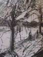
Above all, marvel at the brilliant, fluent drawing of inter-lacing branches, the lines stroked with amazing fluidity and bravura.
But by contrast an individual painting, seen as a whole, sometimes displays a jarring ugliness, which can be put down to too many strident colours, and too few softer tones, or a lack of aerial perspective.
Of course, he is a draughtsman of genius, as good as anyone, ever. I long to see him produce large-scale work in black and white.
Hockney makes much of looking and seeing, but how much is really plein-air painting from life, and how much is studio artifice? Plenty of repetitive pattern-making . Many of the paintings are really huge stage back-drops, or , as Brian Sewell put it on a daytme TV show, scenery for a production of Bambi.
Subscribe to:
Post Comments (Atom)

1 comment:
testing ......
Post a Comment